


garrettm30
-
Posts
186 -
Joined
-
Last visited
Content Type
Profiles
Forums
Latest X-Plane & Community News
Events
Downloads
Store
Everything posted by garrettm30
-
Interesting that they would do this. Thanks for bringing it to our attention. Is it fairly normal to auction off wrecked planes? I've never heard of it before.
-
I can understand the apprehension about moving from 2D panels. It is nice to have all the buttons you need right there without any moving around. A recent experience of mine serves as an example. I recently got my first pay-ware plane: the MU-2 (not to take away from this post within the CRJ-200 section--I surely will be buying that one too!). The first time I took it up, I promptly crashed it. And that was after reading the manuals. I had the recommended amount of aileron trim for takeoff, and then as I gained speed, I was supposed to reduce that left trim. Trouble was that I had to navigate my view around to the aileron trim control. In so doing, I lost the view out my windscreen, and I also lost my artificial horizon. And since I never had the "feel" of flying in the first place because I'm really just sitting at my desk, I had no orientation. I banked pretty hard into the ground. My first impression was that I thought the 3D cockpit pretty, but not practical. But then I discovered PilotView that others have talked about. I designed a set of 8 preset views quickly accessible by keys on the keypad (you can use whatever keys you want). Really, it's all just 2D anyway, since we are looking at flat screens. It essentially allows you to make your own 2D panels from the 3D, but from just the perspective you want. In my case, I made sure every view had some way to keep orientation. No more hunting around to get the right view while racing toward the earth: just a quick key and there it is. It's like you get the best of both worlds: the convenience of the 2D panel that also has the ability to move around when you want it to. And further, when I mapped these views to my keypad, that freed up a couple rocker switches on my yoke that I could then map to elevator and aileron trim. Though frustrating right at first, I have now ended up with better than I started with. Hurray 3D, and hurray Sandy Barbour and his free little PilotView plugin!
-
Sorry to bring up trouble. I was starting to wonder whether I had imagined it. I also could be just a tad paranoid about deleted posts from past experience.
-
Hey, weren't there some more posts in this topic? I feel sure that it has already been explained that the helicopter was there for medical purposes. I also seem to remember that there were more pictures that weren't posted for the benefit of the one involved. Am I making this up?
-
I will surely be reading it. With realistic systems modeling comes realistic study! Seriously, I do appreciate a nicely done manual. Otherwise, what's the point of such fancy systems if we don't know how to use them?
-
There is a type of database attached to Google Maps of various X-Plane scenery. I don't know who maintains it, but this is the first place I always look. Take a look. Just find on the map the place you want an airport for, and see if there is one listed there. Note: I always have to zoom way out first. For some reason, the map starts over the sea. I also like the free scenery from Ted's X-Plane Scenery Page. It is mostly American airports, but there are a few made for the rest of the world. -Garrett
-
X-Plane.org user lemonade brought this article to our attention. (Here is lemonade's original topic on the .org) I found the article to be an interesting read, and so I am mirroring the post here in case any of you might also appreciate the article. Click here for the full article in its original source. As a Mac user, it is to my advantage to advocate an open standard. We should be free to choose the platform we like, whatever it be. DirectX does not allow for such a choice in 3D gaming. -Garrett
-
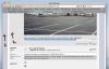
Nerd alert! Ignore this post if you don't care. I didn't join but a couple days ago, but just for the fun of taking part in the discussion, I wish to vidicate crash that there is indeed a lavender tone on this webpage, that is, crash's "light purple." [Note: This totally doesn't matter, and the lavender doesn't bother me. I post just for the fun of it. ] Observe my screen shot of this forum below: I have marked two regions on this page as # 1 and 2. My screen shot will look different according to the monitor of each individual, so I have resorted to the numbers as provided by Photoshop from the digital screen shots (i.e., before the digital information is calibrated and sent to the display). Region #2 is pure gray. It has a brightness value of 89%, but its hue and saturation values are both at 0%. Saturation is the important value, as it represents the amount of color infused in the sample. 0% saturation represents any value from pure white to pure black along a pure gray scale. Hue is irrelevant at 0% saturation, because it essentially means that 0% of the hue is in the sample. Follow me so far? #2 is pure gray. What I have labeled region #1 is the color in question. Photoshop values it at 232° hue on the color wheel, saturation 7%, and brightness at 86%. Again, saturation is the relevant value. 232° is a very definite blue on the color wheel, and this sample has 7% of that blue. The eye (or brain rather) interprets colors in a somewhat relative way--amazing, our sight is! Viewed by itself, that mere 7% of color would be interpreted as gray by our brains. But viewed next to the genuinely pure gray, we can distinguish a bluish hue. If I wasn't clear enough for you to follow those values, let's try it from another angle. Our displays are based on the three colors red, green, and blue (hence the RGB). I bet you all already knew that there are one of each of these colors within a single pixel--well, at the monitor's native resolution at least. So computers represent colors by the intensity values of each sub-pixels, that is, the red, green or blue dots. In 24-bit color, each sub-pixel gets 8 of those bits of information, which yields a range of 256 possible intensities from completely dark to completely illuminated for each sub-pixel, labeled from 0 to 255. Region #2 has digital RGB values of 226 226 226. That means each sub-pixel is lit to the same intensity, and, assuming your monitor can render pure red, green, and blue, it will appear as gray. Region #1 has RGB values of 205 207 220. The blue sub-pixel is illuminated to a higher intensity than the red and green. This variation is what gives us color. In this case, it is that lavender color we are seeing. In the end, as crash has graphics experience, I would suppose he either has a monitor that can better represent a difference as subtle as 7% in saturation than a consumer model, or else he is better able to recognize the difference--possibly both. Of course, none of that matters, but I had fun. Crash, I see purple! (And I still happily use the forum.)
-
My website :) please check it out
garrettm30 replied to Rafael Fernandez's topic in General Discussion
Best of luck to you! -
My website :) please check it out
garrettm30 replied to Rafael Fernandez's topic in General Discussion
I just joined this site yesterday, so I didn't see this post until today, and the website was closed. Just for my curiosity, what were you trying to do? -Garrett -
Basically, X-Plane does not concern itself with the refresh rate of the hardware. That's the business of your monitor and video card. X-Plane just sends as many frames per second as it can churn out. The only thing you can do is make it limit frames to your display, but this is never relevant for me since I keep trying to get every last ounce of graphics beauty I can out of my computer, such that my frame rate hangs around 25-30 when at airports (it is much higher in the air). That, of course is much lower than the refresh rate of my screen. A helpful tip is that you can have X-Plane output all kinds of information, including frame-rate. Go to Settings-->Data Input & Output. That will bring up a near-overwhelming selection of information that X-Plane could send out, and four different ways to output it. There are four master-switches, if you will, at the top of that window. The fourth is for "cockpit display." That is, it will show information on your screen. That checkbox is a master-switch that enables the fourth checkbox for each category in the main part of the window. If you want to see the frame rate X-Plane is managing at each given moment, then check the fourth box next to frame rate, which is the first one on the left. When you exit this screen, the frame rate will be displayed in the upper left corner of your screen, with a couple other bits of info. One of those extras is the vis ratio. Ideally, it will report 1.000. What that says is that the sim is displaying 100% of the details that you have it set to display. If the frame rate drops below the minimum frame rate (default is 19 fps), then it will start dropping out visibility with fog until it reaches a load that the computer can render faster than the minimum frame rate. This is handled dynamically. If your frame rate dips, you will notices a sluggishness as the sim starts limiting visibility, then the frame rate will hang around the minimum but fluidly, and the vis ratio will say something like 0.500, which means you are seeing 50% visibility of what you set. I often keep a close eye on these data so that I can try to get as much graphics quality as my computer will allow.
-
Until some of the other folks get a chance to answer, I will take a stab at #2. The only setting within X-Plane for refresh rate is the setting that can limit the frame rate to the screen refresh rate, half that rate, or no limit at all. V-Sync in other words. The refresh rate is going to be handled by the system settings outside of X-Plane. I'm a Mac guy myself, but if I were you, I'd poke around the advanced options in the display settings in your control panel.
